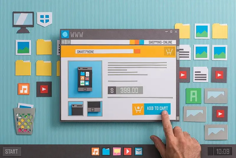
The design of your website is crucial when it comes to overall traffic and conversions. A well-designed site will help you stand out from the competition and increase your search engine rankings. It is important to remember that a website is not just an online brochure – it’s an opportunity for you to engage with potential customers, as well as provide information on products and services they may be interested in purchasing. A well-designed site can also help prevent visitors from leaving before making a purchase decision or signing up for something (such as an email newsletter).
It’s time to simplify your website navigation
It’s time to simplify your website navigation.
Your site navigation is the user interface that allows visitors on your site to find what they are looking for and stay on your site. You want it to be easy for users to navigate through, so they don’t become frustrated and leave. As a rule of thumb, make sure that the most important information is available on your site without having to click more than once or twice.
Let’s face it, simplicity sells. Consumers are inundated daily with multiple options for products and services. Data shows that a majority of Internet users will leave a web page within 10-20 seconds if it is not easy to navigate. Therefore, it is important to make the most important information available to users when they are on your site; otherwise they will leave and find another website that offers what they want and need.
Let’s face it, simplicity sells. Consumers are inundated daily with multiple options for products and services. Data shows that a majority of Internet users will leave a web page within 10-20 seconds if it is not easy to navigate. Therefore, it is important to make the most important information available to users when they are on your site; otherwise they will leave and find another website that offers what they want and need.
This can be done by making sure that you have a clear call-to-action (CTA) on each page so that users know where they need to go next when they finish reading something or looking at an image or video clip (or listening to audio). It’s also essential to provide relevant links so that visitors can quickly access other sections of your website without having to search through endless pages looking for them manually – especially if there are multiple pages within each section!
Web searches are conducted using a variety of devices ranging from smartphones to desktop computers. More often than not, websites are viewed on small mobile devices. Therefore, the simpler your website navigation, the more user-friendly it will be when viewed on small screens. Additionally, you want to keep in mind that users don’t necessarily want to click more than once or twice to find what they are looking for – unless they’re really interested in what you have to offer! So make sure that information is presented clearly and concisely by –
Your navigation links should be simple and intuitive. Organize content by topic, so that visitors can find what they’re looking for quickly.
On the topic of organization, you need to provide enough information for users to make a decision about whether or not this page relates to them (instead of sending them off into the depths of your site). You should also avoid using special characters (such as question marks) in URLs as they can affect search engine optimization (SEO).
Keeping navigation links simple
A good navigation should always be simple and easy to understand.
- Keep your navigation links short and use simple words that are easy to understand, even for people with reading difficulties (or those who don’t speak the same language as you).
- Use a consistent structure for your navigation links. This will help people find what they need quickly, especially if they are used to similar structures from other websites.
- Don’t use too many navigation links or too many words in your navigation links as this is confusing for users and makes it hard for them to remember where everything is located on the site.
Organizing content by topic
- If you have a website that is full of content, it’s important to organize it by topic.
- Use headings to organize content. Headings are an easy way to break up text and make it easier for users to scan your page quickly. Some examples include: “Heading1,” “Heading2,” “Heading3,” and so on.
- Bulleted lists are another great way of breaking up text without taking up too much space on the page. Bulleted lists can be used in conjunction with headings and paragraphs as well, but they should not be used in place of paragraph blocks since they don’t contain information like paragraphs do – only bullets! You can also use bulleted lists for images or tables if necessary as well!
Providing enough information for users to make a decision about whether or not this page relates to them (instead of sending them off into the depths of your site)
One of the best ways to ensure that users are able to find what they need and get back on track is to provide enough information for them to make a decision about whether or not this page relates to them (instead of sending them off into the depths of your site). This can be accomplished in several ways:
- Don’t make users click through multiple pages in order to get the information they want. The user should be able to easily access all the information they need right here, right now. If you have too many links on one page, it will become overwhelming and distracting—so instead, break down each piece of content into separate pages so that each chunk has its own purpose and place. For example, if you have an article about your company’s latest product launch that includes links at the bottom of each paragraph directing readers toward other webpages with more detailed info on pricing or ordering options etc., then create individual subpages within your website that cover those topics instead. That way when someone clicks through from one section in particular section within that article (say “Product Features”) then we’ll send them directly over onto another page without having them scroll around looking for it first!
Website navigation is an important part of overall design and can lead consumers back into your site again and again if done properly!
Website navigation, or the ability to easily find and locate information on your website, is an important part of overall design and can lead consumers back into your site again and again if done properly!
- Make it easy to navigate. If users have to click more than once or twice in order to get where they need to go, they will likely leave the page. The home page should be as simple as possible so that people can find what they’re looking for quickly.
- Organize content by topic. When organizing content by topic, try not to put too many links on a single page; instead keep related pages together so users can easily move between them without having too much trouble locating each new link along their way through your site’s structure.
- Provide enough information for users to make a decision about whether or not this page relates directly with their needs/wants before clicking away from your site altogether because there wasn’t enough relevant information provided up front!
Conclusion
So, if you’re looking for a way to improve your website navigation and better serve your customers, it’s time to take action. Don’t forget that simplicity sells! If you have any questions about web design or how we can help with your next project, please don’t hesitate to reach out. We’d love to hear from you!